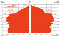
Population pyramid
Bar graph showing the age-sex structure of a population.
It consists of two sets of horizontal bar graphs (one for each sex, with males on the left and females on the right), with the numbers of persons in each age group along the horizontal axis, and ages along the vertical axis.
The first population pyramid was published in 1874 in a statistical atlas of the United States. For a population with high birth and death rates, it is wide at the bottom (young ages) and narrow at the top (old ages), hence the term pyramid. Its shape varies however.
The population pyramid gives an immediate picture of the demographic regime and the history of a country over a long period. When fertility declines and life expectancy increases, as is the case during the demographic transition, the population pyramid changes shape to resemble a cylinder, or even a spinning top if fertility falls below replacement level. Annual fluctuations in birth and death rates are visible in the pyramid, leaving a durable imprint of the crises experienced by a country, such as famine or war, or of temporary surges in the birth rate, such as the baby boom.