Fertilty and infant mortality
Reading the graph
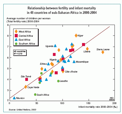
This graph shows the relationship between two demographic indicators: fertility and infant mortality. The values along the horizontal axis indicate the level of infant mortality in each country of sub-Saharan Africa over the period 2000-2004, i.e. the proportion of infants who die before their first birthday (for 1,000 births).
The values along the vertical axis indicate the level of fertility in each country over the same period, expressed as the average number of children per woman. Each country of sub-Saharan Africa is represented by a symbol indicating the region of Africa to which it belongs. A regression line sums up the relationship between the two indicators. The main countries and those located furthest from this line are identified on the graph.
A strong relationship between infant mortality and fertility
Most of the countries on the graph are very close to the regression line: the lower the level of infant mortality, the lower the level of fertility. Africa is following the classic pattern of demographic transition, in which declining fertility is associated with decreasing infant mortality and progress in socioeconomic development and health. Among the countries where infant mortality is around 100 deaths per 1,000 births, fertility in Uganda is particularly high (7 children per woman) while in Lesotho it is much lower (4 children per woman).
Sources
Dominique Tabutin, Bruno Schoumaker, 2004, "The Demography of Sub-Saharan Africa from the 1950s to the 2000s", Ined, Population, 59