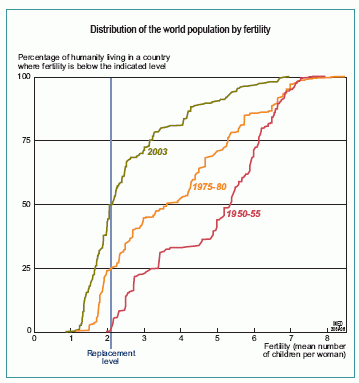
World population by fertility (1950-2004)

Reading the graph
For each period, the graph plots the distribution of countries by their level of fertility. The countries (or regions for China and India) are ranked by the mean number of children per woman. For each level of fertility, the curve shows the proportion of the world population living in a country where fertility is below that level. For example, the red curve shows that in the period 1950-55, around 25% of humanity lived in a country where fertility was below 3.4 children per woman, and that the remaining 75% lived in countries where fertility was above this level.
Median fertility has dropped from 5.4 to 2.1 children in 50 years
The horizontal line at 50% separates the world population into two groups of equal size and shows the median fertility level. In around 1950, median fertility was 5.4 children per woman, while in 2003 it had fallen to just 2.1 children per woman.The vertical line corresponds to 2.1 children per woman. This is the replacement level required to ensure that the population remains constant as each set of parents is replaced by its offspring. The proportion of the world population living in a country with below-replacement fertility increased from 1% in 1950-55 to 25% in 1975-80 and 50% in 2003.
