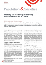
Mapping the massive global fertility decline over the last 20 years
Population and Societies
n° 618, January 2024
https://doi.org/10.3917/popsoc.618.0001
Université libre de Bruxelles and Académie royales des sciences, des lettres et des beaux-arts de Belgique
Université libre de Bruxelles
The world fertility map illustrates the major fertility decline across the world, including in Africa, over the last 2 decades. In 2021, almost two-thirds of the world population lived in zones where fertility is now below replacement level; with a few rare exceptions, fertility decline is a worldwide phenomenon. By breaking down the world into geographical regions of around 35 million inhabitants, the fertility map shows subnational variations in the most populated countries and reveals models of a fertility decline that diffuses from the most urbanized zones towards more outlying areas.
fertility, world, decrease, natality, map, population
Table of contents
- Appendix A References
1.
How many children do women have across the world today? Which world regions have the highest fertility levels? And where has fertility fallen most dramatically? Using an original cartographic approach based on similar population zones, this article gives an overview of global fertility in 2021 and fertility trends over the last 2 decades.
According to the United Nations median projection, the world population will continue to increase over the next 6 decades thanks to improvements in life expectancy and to demographic inertia (i.e. today’s children and young adults will have children of their own). However, this growth will probably be slowed by the rapid fertility decline currently under way. In 2021, the worldwide total fertility rate1 (TFR) was 2.3 children per woman, down from 5.1 in 1965, 4.8 in 1970, 3.7 in 1980, 3.3 in 1990, and 2.8 in 2000. The speed of decline has also accelerated since 2015, with a decrease of 0.17 children per woman between 2015 and 2020, compared with a 5-year average of 0.07 between 2000 and 2015.
1.1. An original cartographic approach based on population zones
In cartography, the use of graphics and symbols is not always neutral: it may influence perceptions and point up scientific and political issues. For example, representing the entire Soviet Union as a single block of colour gave an impression of homogeneity, while dividing it into separate zones revealed its true heterogeneity. Maps of fertility across the world are generally based on country-level data. While useful for comparing countries, this form of representation has a dual disadvantage [1]. First, it erases all variations within a country; while institutional frameworks of nations often contribute to determining sociocultural attitudes or behaviours, large spatial disparities may exist within them. Second, it provides no information on the number of people concerned by the phenomenon in question.
On our map, fertility levels are indicated by proportionally sized circles in 235 zones of similar population size comprising between 30 and 40 million inhabitants (Box 1). This breakdown divides the world into a similar number of entities as countries across the globe. Moreover, it avoids the need to divide certain geographical regions into small territorial units for which data are lacking or difficult to obtain. With each circle representing a population of the same order of magnitude, the map thus provides an explicit visual summary of the population distribution across the globe.2 Moreover, unlike the commonly used Mercator projection, which distorts the regions close to the poles and inflates their size, the chosen representation better respects the proportionality of the different landmasses.
Widely scattered circles indicate sparsely populated areas, while clusters of closely spaced circles signal areas of high population density.
1.2. Two-thirds of the world population with below-replacement fertility
According to the world fertility data published in World Population Prospects (Box 2), only a handful of zones in the world still have TFRs above 3.0 children per woman (Figure 1). They are found mostly in Africa, certain parts of the Middle East, Afghanistan, and Pakistan [2]. TFRs above 5.0 are found only in the Sahel, Central Africa, and the Horn of Africa.
Conversely, fertility is below replacement level (2.1 children per woman) in 152 of the 235 zones that now account for 63% of the world population (vs. 45% in 2000). The lowest levels are observed in Chinese coastal megacities, Manchuria, and South Korea, where the TFR is below one child per woman. The low-fertility category, which already included the populations of Europe and eastern Asia in the 2000s, now also encompasses almost all the Americas, a large part of India, Indonesia and, recently, the Philippines. It is in India that the subnational contrasts are most striking. In southern and western India and in Bengal, the TFR is below 2.1 almost everywhere (and even below 1.5 on the Maharashtra coast, in southern Karnakata and in the Kolkata region). By contrast, in the poor and densely populated states of the Ganges valley, fertility is still between 2.3 and 3.0. It has fallen sharply since 2000, however, when the TFR was between 4.3 and 4.8 (Figure 2).
The scale of fertility decline across the world can be grasped by comparing the maps of 2000 and 2021. In 2000, a vast area of high fertility could still be observed, including not only Africa but also the entire Middle East, the northern half of India, and the Philippines. While contrasts between India and China still exist, they were much more pronounced in 2000 than today. In the Americas, TFRs of between 2.1 and 3.0 were the norm; only the populations of Canada, the eastern United States and the metropolitan areas of southern Brazil had levels below 2.1. Twenty years later, the geography of fertility has changed radically. Based on on Figure 3 and Figure 4 in the online appendix (https://doi.org/10.34847/nkl.4156f719), a typology of 8 geographical categories can be constructed by crossing fertility levels in 2021 with trends since 2000.
1.3. 41% of the global population lives in very low fertility zones
In a large majority of the very low fertility zones (below 1.7 children) in 2021, fertility has continued to decline over the last 2 decades (81 Type 1 zones). Only in a much smaller number of these zones has it increased slightly (16 Type 2 zones). Type 1 zones correspond to two situations. The first is that of developed countries where the moderate-fertility nuclear family model is well established and where fertility was already below replacement level by the early 1970s. Since 2000, the decline in these zones (most of Europe, Japan, and the eastern and western seaboards of the United States) has been small, as fertility was already low. The second corresponds to countries where fertility decline is recent, with a dramatic fall from an initially high level (South Korea, Taiwan, Türkiye, Iran, Brazil, and Colombia). In many cases, the downturn began in the metropolitan centres and then spread across the country, as in Brazil, Mexico, or China, where fertility in the eastern zones dropped below replacement level around 1990 (despite a one-child policy in force since 1979) before the decline reached more inland areas.3
Type 2 zones have very low fertility but are among the few areas in the world to experience a slight rebound since 2000. Fertility in these zones was already below replacement level by the early 1970s, or even the late 1960s, due partly to the difficulties faced by women in reconciling work and family life. These zones include German-speaking Europe, northern Italy and Spain, Central Europe, Ukraine, and Russia. The slight upturn in Western Europe may be partly linked, as in Germany, to the recent inflow of immigrants with higher levels of fertility. In Central Europe, Ukraine, and Russia, the small rebound may reflect the recent stabilization of these countries after the economic collapse in the 1990s that led to cutbacks in social welfare and preschool childcare.
1.4. A variety of profiles in low- and moderate-fertility zones
Low-fertility zones (TFR between 1.7 and 2.1, Type 3) accounted for 22.6% of the world population in 2021. They include zones of developed countries where birth control is long-established—but where fertility remained above 2.1 children for many years (France [3], inland United States, Australia, and the southern cone of Latin America)—and zones in Southern countries where fertility has fallen sharply from levels often still above 3.0 children per woman in 2000. These may be peripheral regions converging towards the national fertility model (in Iran, Türkiye, and China) or, conversely, pioneer zones of the national fertility transition in India, Southeast Asia, and Indonesia (Java). They also include the Gulf states.
In 2021, moderate-fertility zones (TFR between 2.1 and 3.5, Types 4–6) accounted for 20.5% of the world population. In Type 4, the transition, while well advanced, is slowed by religious and cultural inertia, and sometimes by the obstacles to labour market participation for educated women (Morocco, Egypt, South Africa, Near East, and the Karachi region). By contrast, Type 5 covers zones where fertility was still high in 2000 but which are rapidly converging towards the dominant models of their country or macroregion (Andes, Amazonia, Guatemala, southern Mexico; Syria, Sunni Iraq, Arabia; Ganges valley, outlying regions of Bangladesh; Cambodia and Laos, southern Philippines), or which are leading the macroregional transition in Africa (northern Ethiopia, western Kenya). In zones of Type 6, the fertility decline stalled after 2000. The only regions concerned are North Africa, excluding Morocco, where the sharp increase in age at marriage has now levelled off [5], and former Soviet central Asia, where the stall reflects a return to stability after the dark years of the 1990s; the exodus of less fertile Slav populations may also have played a role.
1.5. Fertility is now declining in practically all high-fertility zones
High-fertility zones (more than 3.5 children per woman; Types 7 and 8) now represent just 16.1% of the world population. While their transition is just beginning, fertility in these zones has declined remarkably, to an extent not foreseen even 2 decades ago, falling by between 1.0 and almost 3.0 children per woman over the last 20 years in zones of Type 7 and by around 0.8 children per woman, on average, in those of Type 8. The factors behind the onset of this recent decline include an increase in age at marriage, wider (though still far from universal) school enrolment for girls, and greater female labour market participation. Access to contraception has also increased in these zones, at a speed that varies across countries, although unmet needs often remain high. Lower infant mortality also reduces ‘demand’ for births. The process spreads out from the most urbanized zones (Type 7) to the more outlying ones (Type 8), as shown by the higher fertility in Sahelian zones of Africa compared with the more urbanized coastal regions of West Africa [6, 7].
***
Applying an original approach, the maps described here represent variations in fertility levels across the world independently of national boundaries. They confirm that the entire world population is now converging towards a low-fertility model, even in regions where, just 30 years ago, behaviours appeared immobile in this respect. Almost two-thirds of the world population now live in zones with below-replacement fertility. Fertility decline in the Global South is occurring at speeds never observed in the North during its period of transition.
1.5.1. Box 1. Constructing the 235 population zones
The 235 zones with populations of around 35 million were constructed empirically by aggregating more than 3,500 contiguous territorial entities. Wherever possible, state borders and major subnational divisions such as federal entities were respected, and territorial units with similar levels of population density and development were grouped together. Advancing in progressive stages to obtain populations of similar size, the same method of matching like with like was used to group nations with small populations into a single zone. The three Benelux countries are one such example. The Scandinavian countries and Finland were grouped with Schleswig-Holstein, a state of northern Germany, to reach the requisite population size (rather than the Baltic countries, whose levels of wealth are very different). The methodology is presented in more detail in the online appendix, available at https://doi.org/10.34847/nkl.4156f719.
The mean population of the 235 zones was 33.7 million in 2021, with a standard deviation of 4.1 million (with a coefficient of variation—the ratio of the standard deviation to the mean—of 0.12). In terms of the number of observations (239 countries) and the mean population size of 33.1 million, this distribution is comparable to a representation by country but with a much smaller diversity of population sizes. With a breakdown by country, the standard deviation is 134.9 million, and the coefficient of variation is 4.08.
The mean population of these 235 zones was 26.2 million in 2000, with a standard deviation of 5.7 million (coefficient of variation 0.22). The higher standard deviation in 2000 reflects the diversity of demographic dynamics observed in the zones between 2000 and 2021.
1.5.1. Box 2. Fertility data
To maximize data homogeneity, country-level data were obtained from a single source, the 2022 edition of World Population Prospects (WPP).(a) The values of the basic units were then fitted to these data. For each zone within a country, we used available regional data (Eurostat, OECD, censuses and other national sources, and GlobalDataLab) for the year closest to 2021 (or 2000). The ratio of these regional values to the national value supplied by the same source was then applied to the country-level WPP value. We thus assume that regional fertility behaviours remained relatively unchanged with respect to national behaviours between 2021 and the closest year to 2021 for which regional data are available (and the same for 2000 and the year closest to 2000). The acceptability of this assumption is confirmed by the near constancy of relative regional values in countries where data series for different years are available.
(a) https://www.un.org/development/desa/pd/content/World-Population-Prospects-2022
Appendix A References
-
[1] Didelon-Loiseau C., Vandermotten C., Dessouroux C. 2017. Un autre monde ? Cartographier le monde sans frontière : enjeux méthodologiques et sociaux. Cartes et géomatique, 234, 103–114.
-
[2] Goujon A., Wazir A., Gailey N. 2020. Pakistan : un pays de plus de 200 millions d’habitants en retard dans la transition démographique. Population & Sociétés, 576. https://doi.org/10.3917/popsoc.576.0001
-
[3] Pison G. 2020. France, la fécondité la plus élevée d’Europe. Population & Sociétés, 575. https://doi.org/10.3917/popsoc.575.0001
-
[4] Sobotka T. 2021. Un tiers des femmes de l’Asie de l’Est resteront sans enfant. Population & Sociétés, 595.https://doi.org/10.3917/popsoc.595.0001
-
[5] Ouadah-Bedidi Z., Vallin J., Bouchoucha I. 2012. La fécondité au Maghreb : nouvelle surprise, Population & Sociétés, 486. https://doi.org/10.3917/popsoc.486.0001
-
[6] Cheng H., Luo W., Si S. et al. 2022. Global trends in total fertility rate and its relation to national wealth, life expectancy and female education. BMC Public Health, 22, 1346. https://doi.org/10.1186/s12889-022-13656-1
-
[7] Locoh T., Vallin J. 1998. Afrique noire : la baisse de la fécondité. Population & Sociétés, 338.
The TFR corresponds to the number of children a woman would have if she experienced the current age-specific fertility rates throughout her reproductive life.
Another solution would be to use maps that simply divide the largest nations into their various sub-entities. However, this would not solve the problem of unequal population distribution across these entities. It is also possible to use anamorphic maps that distort the various entities to make the size of each one proportional to its population, but countries and regions become difficult to identify.
In China and in eastern Asia generally, non-marital births are rare, so the increase in age at marriage has contributed to fertility decline more strongly than in Europe [4].
The world fertility map illustrates the major fertility decline across the world, including in Africa, over the last 2 decades. In 2021, almost two-thirds of the world population lived in zones where fertility is now below replacement level; with a few rare exceptions, fertility decline is a worldwide phenomenon. By breaking down the world into geographical regions of around 35 million inhabitants, the fertility map shows subnational variations in the most populated countries and reveals models of a fertility decline that diffuses from the most urbanized zones towards more outlying areas.
Christian Vandermotten (Université libre de Bruxelles et Académie royale des sciences, des lettres et des beaux-arts de Belgique)
Christian Dessouroux (Université libre de Bruxelles)
Cite the article
Christian Vandermotten, Christian Dessouroux, Mapping the massive global fertility decline over the last 20 years, 2024, Population and Societies, no. 618
 This document may be reproduced free of charge on paper or online using our Creative Commons licence.


